
The Guardian uses pseudo-science to libel John Christy
See Republicans' favorite climate chart has some serious problems
The Guardian - Dana Nuccitelli
By Christopher Monckton of Brenchley
One Dana Nuccitelli, a co-author of the 2013 paper that found 0.5% consensus to the effect that recent global warming was mostly manmade and reported it as 97.1%, leading Queensland police to inform a Brisbane citizen who had complained to them that a “deception” had been perpetrated, has published an article in the British newspaper The Guardian making numerous inaccurate assertions calculated to libel Dr John Christy of the University of Alabama in connection with his now-famous chart showing the ever-growing discrepancy between models’ wild predictions and the slow, harmless, unexciting rise in global temperature since 1979.
The chart, described by Nutticelli as “simply another example of cherry picked data … presented in a multiply misleading way”, shows his comments. Each comment is then given in more detail in bold face, followed by the truth in Roman face.
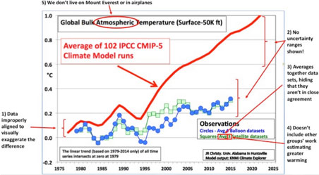
1. “The data are misleadingly misaligned” to start in 1979, so as “to visually exaggerate any difference between the models and data”. Instead, Mr Nutticelli opines that they should have been aligned to a common baseline some decades in length.
Altering the baselines does not alter the trends. Nevertheless, to test Mr Nucccitelli’s allegation that Dr Christy had “misleadingly misaligned” the data, trends on the models’ predictions (red), satellites’ observations (green) and radiosondes’ measurements (blue) were expressed as centennial-equivalent warming rates of 2.22, 1.00 and 0.86 Celsius degrees respectively. The warming rate predicted by the models is thus some 2.2-2.5 times the warming rates observed by the satellites and radiosondes. The graph, therefore, correctly reflects a real and widening discrepancy between prediction and observation. Note also that the CMIP5 predictions were made in about 2010, so that nearly all the red curve represents hindcasts: yet still the models’ trend is excessive.
2. “No uncertainty ranges are shown whatsoever”. When they are taken into account, “the observations are consistent with the range of model projections”.
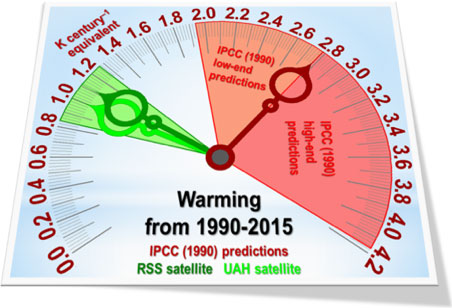
Data since 1979 for the CMIP5 models were not to hand. However, in 1990 IPCC (AR1, p. xxiv), on the basis of “substantial confidence” that the models on which it relied had captured all essential features of the climate, predicted near-linear warming of 1.0 [0.7, 1.5] Celsius degrees over the 36 years 1990-2025, equivalent to 2.78 [1.94, 4.17] Cº/century. The boundary between the two zones, marked with the red needle in the clock-graph below, is the IPCC’s then best prediction: warming equivalent to about 2.8 C°/century by now.
The very wide range of predictions made by the IPCC is shown as orange and red regions. The observed warming on the RSS and UAH satellite datasets, again expressed as centennial equivalents, is shown by the two green needles. The HadCRUT4 dataset, to Dr Jones’ credit, publishes its combined measurement, coverage and bias uncertainties, which are about 0.16 Celsius degrees either side of the central estimate. The satellite uncertainties are smaller. It is plain that there is no overlap whatsoever between the exaggerated predictions made by IPCC in 1990 and the rates of global warming since then shown by the satellites.
3. “Observational data disagreements are hidden,” because “Christy’s graph also averages together multiple different observational datasets, which aren’t in terribly close agreement.”
In the present context, disagreements between trends on the RSS and UAH satellite datasets, for instance, would only be material if either of the datasets showed a trend close to the trend on the models’ predictions: otherwise, such differences would be inconsequential when set against the far wider difference between the trend on each observational dataset and the trend on the models’ predictions.
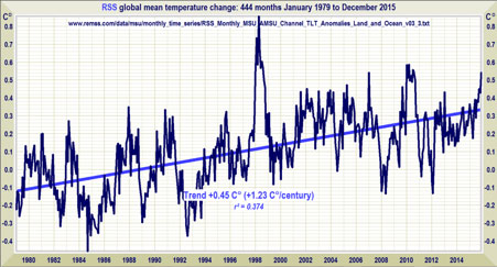
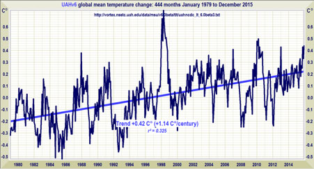
To test whether the two satellite datasets “aren’t in terribly close agreement”, their spline-curves and trends from 1979-2015 were separately determined and plotted. Results showed that the two curves are visibly in reasonable agreement.
To verify this, copy each graph on to a PowerPoint slide, start the presentation and then use the up and down arrows in rapid succession to make a blink-comparator.
Their centennial-equivalent trends are within a tenth of a degree of one another, whereas the differences between each of the two observed trends and the model-predicted trend are each an order of magnitude greater than the difference between them.
4. “The chart isn’t peer-reviewed or easily reproducible”, in that “Christy doesn’t say which observational data sets he’s averaging together”.
Mr Nutticelli did not email Dr Christy and simply ask for the information. On one occasion when I asked Dr Christy for some data to assist me in a paper I was writing, I received the requested data within 24 hours. My questions about the data were answered promptly, courteously, fully and helpfully. Furthermore, the chart is plainly labeled indicating that it was prepared using the online and publicly available Climate Explorer program and data maintained by the Royal Netherlands Meteorological Institute.
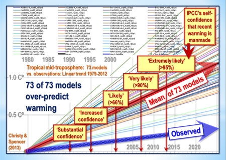
Had Mr Nutticelli done a little homework, he would have been able to find the following widely-circulated graph that actually lists 73 of the models used by Dr Christy, and shows IPCC’s ever-increasing confidence in the “consensus” proposition that recent global warming was mostly manmade. In fact, as Mr Nuccitelli knows full well (for his own data file of 11,944 climate science papers shows it), the “consensus” is only 0.5%. But that is by the bye: the main point here is that it is the trends on the predictions compared with those on the observational data that matter, and, on all 73 models, the trends are higher than those on the real-world data.
5. “We don’t live on Mount Everest: the average elevation of the bulk atmosphere shown in Christy’s graph is 25,000 feet, which is just below the peak of Mount Everest, and not far below the elevation at which commercial aircraft generally fly. The temperature at such high elevations isn’t very relevant to humans.”
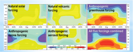
Mr Nutticelli seems unaware that IPCC (2007), following Santer (2003), regarded the atmosphere six to eight miles up as highly relevant to humans: for that was the altitude of the model-predicted tropical mid-troposphere “hot spot”, the supposed “fingerprint” of manmade warming. The “hot spot” was supposed to warm at twice or thrice the tropical surface rate:
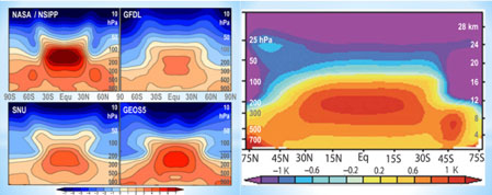
The models were as wrong about this as about everything else. There is no “hot spot”, as the following graph from Karl et al. (2006) shows.
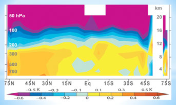
If, therefore, Santer and IPCC had been correct that the “hot spot” was a fingerprint of anthropogenic global warming, the absence of the “hot spot” would have been the end of the profitable climate scam. However, the models and those who profit from their bizarre predictions were as wrong about this as they are about their other global-temperature predictions.
The truth is that the “hot spot” ought to appear if there is any significant warming of the atmosphere, and that its absence in real-world radiosonde measurements, shown in Karl’s graph, provides powerful confirmation that the satellite lower-troposphere datasets, rather than the surface tamperature datasets that Mr Nutticelli criticizes Dr Christy (keeper of the UAH satellite dataset) for not showing on his graph, are accurate in showing little or no warming over the past two decades.
Furthermore, since the rate of warming diminishes with altitude, the effect of including the mid-troposphere with the lower troposphere in Dr Christy’s graph is actually to show a discrepancy between models’ predictions and real-world observations that is somewhat smaller than it would have been if the analysis had been confined to the lower troposphere alone.
Mr Nutticelli also seems unaware that no small reason why John Christy’s graph shows temperature changes in the combined mid-troposphere and lower troposphere is that these are the zones in which the radiosondes take their readings.
6. “The rest of the global warming data show climate models are accurate. … For example, climate models have done an excellent job predicting how much temperatures at the Earth’s surface would warm.”
To test this remarkable assertion, the predictions of medium-term global warming made by the IPCC in 1990, 1995 and 2001 (red needles) were compared with the observed warming rates reported by three terrestrial (blue needles) and two satellite (green needles) datasets. The results showed that over each timescale – 26, 21 and 15 years respectively – the models had very greatly over-predicted the warming rate.

7. “And then there’s ocean heating. … Climate models are doing a very good job predicting the rate at which the oceans are heating up.”
Mr Nutticelli appears unaware that in the 11 full years of ARGO bathythermograph data that are available at the time of writing, from 2004-2014, the rate of warming of the upper mile and a quarter of the ocean was equivalent to just 1 Celsius degree every 430 years, as the graph of ARGO data shows.
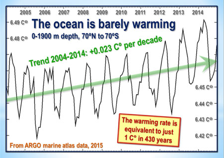
Furthermore, the temperature profile at different strata shows little or no warming at the surface and an increasing warming rate with depth, raising the possibility that, contrary to Mr Nutticelli’s theory that the atmosphere is warming the ocean, the ocean is instead being warmed from below, perhaps by some increase in the largely unmonitored magmatic intrusions into the abyssal strata from the 3.5 million subsea volcanoes and vents most of which Man has never visited or studied, particularly at the mid-ocean tectonic divergence boundaries, notably the highly active boundary in the eastern equatorial Pacific.
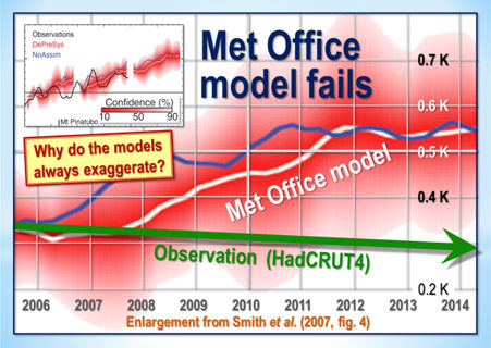
How good a job are the models really doing in their attempts to predict global temperatures? Here are a few more examples:
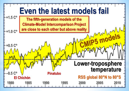
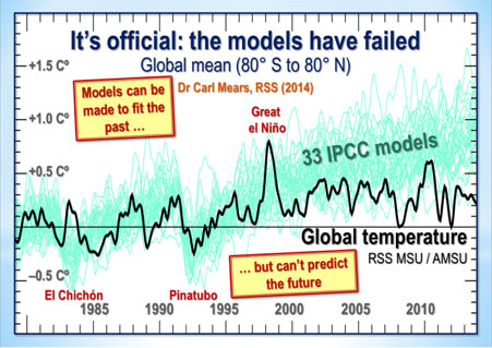
Mr Nutticelli’s scientifically illiterate attempts to challenge Dr Christy’s graph are accordingly misconceived, inaccurate and misleading.
A report of the inaccuracies should be sent to the editor of The Guardian with a request for an explanation, for the inaccuracies, delivered in the snide, supercilious tone that is Mr Nutticelli’s disfiguring trademark, are calculated to be unfairly damaging to Dr Christy’s reputation as a scientist.
In the event that the editor fails to take appropriate action against Mr Nutticelli and his low brand of yellow journalism, the case should be referred to the newspaper editors’ watchdog body by way of a formal complaint, whereupon The Guardian will be compelled to correct its inaccuracies.